6 Measuring network robustness
Alessandro Vindigni
session 22/03/2024
In this session we will use the following R-packages and external sources that you are encouraged to load
library(rjson)
library(dplyr)
library(igraph)
library(rweboflife)
library(ggplot2)
library(latex2exp)
library(formattable)
source("~/ecological_networks_2024/downloads/Functions/helper.R")
6.1 Data collapsing and cirticality
During the lecture we have shown you several plots of the average size of the largest cluster \(C_{max}\) as a function of the fraction of removed nodes \(f\), for different types of (simulated) networks. Curves obtained for networks of different size \(N\) were normalized plotting the ratio \(C_{max}/N\) vs \(f\). However, according to the theory of critical phenomena, in the neighborhood of the critical fraction \(f_c\) curves obtained for different network sizes \(N\) should collapse onto a single master curve if plotted as \[\begin{equation} y=\frac{C_{max}}{N^{\Delta_c}} \quad \text{vs}\quad x=\frac{f-f_c}{N^{\Delta_f}} \end{equation}\] We consider random removal of nodes in a honeycomb lattice and in the Erdos-Renyi graph for which the \(\Delta\) exponents can be computed analytically and take the values
| model | \(\Delta_c\) | \(\Delta_f\) |
|---|---|---|
| Erdos-Renyi | 2/3 | 1/3 |
| 2D percolation | 303/288 | 3/8 |
Exercise 1
honeycomb lattices
Load the data computed by us for honeycomb lattices of size \(N=900,\, 10'000,\ 22'500\) nodes and bind those datasets into a single dataframe
path_to_data <-"~/ecological_networks_2024/downloads/Data/network_robustness/"
load(paste0(path_to_data, "hc_lattices_30.RData"))
load(paste0(path_to_data, "hc_lattices_100.RData"))
load(paste0(path_to_data, "hc_lattices_150.RData"))
df_all_hc <- rbind(df_hc_30_rnd,df_hc_100_rnd,df_hc_150_rnd)
You can define \(f_c\) from the percolation threshold corresponding to a 2D honeycomb lattice. Adjust the value of \(\Delta_c\) and \(\Delta_f\) in the underlying code chuck and add the two columns that are needed to plot the master curve to the df_all_hc dataframe
Delta_c = 303./288  # set the appropriate value
Delta_f = 3./8      # set the appropriate value
f_c = 1-0.697       # 1 - (precolation threshold)
df_collapse_hc <- df_all_hc %>% mutate(f = 1.-n_nodes/N,
                                       x = (f-f_c)*(N**Delta_f),
                                       y = C_max/(N**Delta_c))
Plot the master curve using the following commands and check that data for different \(N\) actually collapse in some part of the plot. In your opinion, what defines the extent of the region where data-collapsing is realized?
ggplot() +
  ggtitle("Honeycomb lattice collapse N = 900, 10'000, 22'500")+
  geom_point(data = filter(df_collapse_hc, N==22500), aes(x,y), color = "turquoise3",shape = 1,size =0.5) +
  geom_point(data = filter(df_collapse_hc, N==10000), aes(x,y), color = "dodgerblue4",shape = 1,size =0.5) +
  geom_point(data = filter(df_collapse_hc, N==900), aes(x,y), color = "darkseagreen4",shape = 1,size =0.5) +
  ylab(TeX("$y$")) +
xlab(TeX("$x$")) + scale_y_continuous(trans='log10') 
Erdos-Renyi graphs
For Erdos-Renyi graphs, instead, load the data
load(paste0(path_to_data, "er_graph_30.RData"))
load(paste0(path_to_data, "er_graph_100.RData"))
load(paste0(path_to_data, "er_graph_150.RData"))
df_all_er <- rbind(df_er_30_rnd,df_er_100_rnd,df_er_150_rnd)
Readout the initial value of \(N\) from the three dataframes to extract (with filter()) the relative curves from df_collapse_er. Use the values of \(\Delta_c\) and \(\Delta_f\) typical of the Erdos-Renyi model, and set \(f_c = 0.75903\).
Repeat the process to produce the master curve \(x\) vs \(y\) for this model.
Do you notice any difference between the data-collapsing realized in the two models? Is the master curve the same?
Delta_c = 2/3
Delta_f = 1/3
f_c = 0.75903 # 1 - (precolation threshold)
df_collapse_er <- df_all_er %>% mutate(f = 1.-n_nodes/N,
                                       x = (f-f_c)*(N**Delta_f),
                                       y = C_max/(N**Delta_c))

ggplot() +
  ggtitle("Erdos-Renyi collapse N = 859, 9'529, 21'399")+
  geom_point(data = filter(df_collapse_er, N==21399), aes(x,y), color = "turquoise3",shape = 1,size =0.5) +
  geom_point(data = filter(df_collapse_er, N==9529), aes(x,y), color = "dodgerblue4",shape = 1,size =0.5) +
  geom_point(data = filter(df_collapse_er, N==859), aes(x,y), color = "darkseagreen4",shape = 1,size =0.5) +
  ylab(TeX("$y$")) +
xlab(TeX("$x$")) + scale_y_continuous(trans='log10') 
6.2 Haslemere dataset
In this section we analyze a dataset on human social interactions specifically gathered in 2017 with the aim of modeling the spreading of infectious diseases. These high-resolution GPS data were collected tracing 469 volunteers by means of a mobile-phone app. The volunteers were residents of the town of Haslemere, where the first evidence of UK-acquired infection with COVID-19 would later be reported. Raw data are available here, while more details on data collection can be found in this preprint.
# Import data from a csv file into an R dataframe.
# Note that this file separates columns with ",".
# Thus, we specify the separator when calling the read.csv function
data_haslemere <- read.csv(paste0(path_to_data,"Haslemere_Kissler_DataS1.csv"), sep = ",")

# Assign names to the columns
names(data_haslemere) <- c("time_step","person_A", "person_B", "distance")
As per good practice, let us check the class of the object data_haslemere and have a quick look at its data structure.
## [1] "data.frame"| time_step | person_A | person_B | distance |
|---|---|---|---|
| 1 | 2 | 215 | 9 |
| 1 | 2 | 246 | 18 |
| 1 | 2 | 265 | 45 |
| 1 | 5 | 367 | 32 |
| 1 | 5 | 430 | 17 |
| 1 | 8 | 10 | 13 |
Build up networks from Haslemere dataset
The function interaction_by_distance_and_time(df, \(R\), \(t_{inf}\)) takes as arguments
df: dataframe containing the Haslemere dataset loaded from csv file- \(R\): maximal distance between person_A and person_B in meters
- minimum time of interaction in units of 5 min, i.e., \(t_{inf}=6\) means that two individuals have interacted at least for half an hour.
interaction_by_distance_and_time  <- function(df, R, time_inf, day = NULL){
  # filter by day
  if(is.null(day)){
    print("day NULL")
    data_period <- df
  } else {
    print(paste0("day = ",day))
    istep_min <- 1 + (day-1)*192
    istep_max <- day*192
    data_period <- filter(df, between(time_step, istep_min,istep_max))
  }

  # filter by distance shorter than R[m]
  data <- data_period %>% filter(distance < R) %>% dplyr::select(person_A, person_B)

  # create incidence matrix
  inc_mat <- incidence_matrix_from_raw_data(data)

  # filter by cumulative time spent closer than R longer than time_inf
  incidence_matrix <- 1*(inc_mat > time_inf)

  return(incidence_matrix)
}
Note that the function incidence_matrix_from_raw_data() is loaded from the file helper.R.
Once you have created the incidence matrix associated with the “rule” that defines the contact between two people, you can obtain a graph using the function graph_from_incidence_matrix() of the igraph package. To highlight the effect of the time spent at a distance smaller than \(R\) between two individuals, consider the following cases
- \(R=100\) and \(t_{inf}=0\) \(\Rightarrow\) everybody is connected to everybody
- \(R=50\) and \(t_{inf}=6\) \(\Rightarrow\) pairs of people who have come closer than 50 m for at least 30 min in 3 days (48h).
The two datasets exemplified above are produced passing the following arguments to the function interaction_by_distance_and_time():
R <- 100
time_inf <- 0 # any contact within 48 h
inc_mat_100_0 <- interaction_by_distance_and_time(data_haslemere, R+1, time_inf)
## [1] "day NULL"R <- 50
time_inf <- 6 # 30 min within 48 h
inc_mat_50_6 <- interaction_by_distance_and_time(data_haslemere, R+1, time_inf) ## [1] "day NULL"We can then use the function graph_from_incidence_matrix() of igraph to convert both incidence matrices into graph objects:
graph_100_0 <- graph_from_incidence_matrix(inc_mat_100_0)
graph_50_6 <- graph_from_incidence_matrix(inc_mat_50_6)
Playing with the parameters \(R\) and \(t_{inf}\) networks with different topology are produced. Now we are going to visualize these two examples:

\(R=50\) and \(t_{inf}=6\) (30 min within 48 h)

To assess the robustness of this contact network we will use the package rweboflife, developed by our group and available in our GitHub workspace. In particular, the function we are going to use takes a non-named edgelist, with an array format, as input. The conversion from a graph object to the proper format can be made with igraph:
Then we need to pass to the function a vector of the nodes we want to remove, named according to their index (an integer not a character!)
vec_n1 <- edge_list[,1]
vec_n2 <- edge_list[,2]
vec_all <- union(vec_n1, vec_n2)
vec_rm <- unique(vec_all)
Now we are in the position to compute the average size of the largest cluster \(C_{max}\) as a function of the number of removed nodes. The average is performed iterating the progressive removal of nodes (simulation) as many times as defined by the parameter num_iter.
For random removal strategy (RND) we use the function inverse_percolation()
num_iter <- 20    # number of replicates of the simulation
imeasure <- 1     # how many nodes are removed between one measure of C_max and the next one
rnd_seed <- 7625434 # seed for the random number generator
df_helsemere_rnd <- rweboflife::inverse_percolation(edge_list, vec_rm, num_iter, imeasure, rnd_seed)
Let us add to the df_helsemere_rnd dataframe a pair of columns \(f\) and \(\kappa\),
representing the fraction of removed nodes and the Molloy-Reed connectivity parameter, respectively (run the underlying command).
Exercise 2
Assume you were in the COVID-19 taskforce and you were asked for advice to hinder the pandemic. A possible strategy could be to change people habits so that their contact network becomes disconnected (subcritical phase).
- Lookup the
df_helsemere_rnd_analysisdataframe
and identify the size of the largest cluster \(C_{max}\) corresponding to the critical threshold of \(\kappa \simeq 2\) (Molloy-Reed criterion).
- Play around with the values of \(R\) and \(t_{inf}\) till a similar value of \(C_{max}\) as that determined at the previous point is obtained.
HINT:
R <- 10
time_inf <- 6 # 30 min within 48 h
my_inc_mat <- interaction_by_distance_and_time(data_haslemere, R+1, time_inf)
my_graph <- graph_from_incidence_matrix(my_inc_mat)
my_C_max <- max(igraph::components(my_graph)$csize)
Plot the resulting graph and check visually that it actually corresponds to a disconnected network.
Provide a concrete suggestion for decision makers, such as “we need to set rules (e.g., lockdown) in order that ONLY people who in ordinary conditions spend at least half an hour per day at a distance smaller that 10 meters can keep interacting”.
6.3 Robusteness of empirical networks
We consider here the evolution of the largest cluster under the removal of nodes of two networks that are available on Web of life: the pollination network M_PL_015 and the foodweb FW_013_03.
To download the pollination network we use the syntax described in the first exercise session:
# download the network from the web-of-life API
base_url <- "https://www.web-of-life.es/"
json_url <- paste0(base_url,"get_networks.php?network_name=M_PL_015")
M_PL_015_nw <- jsonlite::fromJSON(json_url)
# create a graph (meaning igraph object)
M_PL_015_graph <- M_PL_015_nw %>% select(species1, species2, connection_strength) %>%
  graph_from_data_frame()
As done for the Haslemere dataset, we compute the average size of the largest cluster \(C_{max}\) as a function of the number of removed nodes \(f\), using functions in the package rweboflife available in our GitHub workspace. Similarly to what done before, we need to prepare and edgelist
in terms of node indexes (an integer not a character!):
and vector of the nodes we want to remove.
vec_n1 <- edge_list[,1]
vec_n2 <- edge_list[,2]
vec_all <- union(vec_n1, vec_n2)
vec_rm <- unique(vec_all)
For random removal strategy (RND) we use the function inverse_percolation()
num_iter <- 20
imeasure <- 1
rnd_seed <- 8625434
df_M_PL_015_rnd <- rweboflife::inverse_percolation(edge_list, vec_rm, num_iter, imeasure, rnd_seed)
while we should use the function systematic_removal() for systematic removal of nodes, from most-to-least connected (MTL)
num_iter <- 2
imeasure <- 1
rnd_seed <- 8623457
df_M_PL_015_mtl <- rweboflife::systematic_removal(edge_list, vec_rm, num_iter, imeasure, TRUE, TRUE, rnd_seed)
or from least-to-most connected (LTM)
num_iter <- 2
imeasure <- 1
rnd_seed <- 8623457
df_M_PL_015_ltm <- rweboflife::systematic_removal(edge_list, vec_rm, num_iter, imeasure, FALSE, TRUE, rnd_seed)
respectively (note that the first of the two boolean arguments changed form TRUE to FALSE).
The returned dataframe consists of the following columns
- id = integer identifying a row
- N = initial number of nodes in the network
- n_nodes = current number of nodes at a given stage of the simulation
- n_nodes1 = current number of nodes of type 1 (those that are actively removed)
- n_nodes2 = current number of nodes of type 2
- k_ave = current average degree of the network
- k_sd = current averaged squared degree of the network
- C_max = largest cluster size (in number of nodes)
Exercise 3
Cut and paste the code chucks provided above to produce the dataframes
df_M_PL_015_rndanddf_M_PL_015_mtl. Achtung: the second simulation (MTL) takes roughly 20 sec. per iteration: try to choose the good compromise between having a smooth enough curve and not taking ages to produce it.Add to each dataframe a pair of columns \(f\) and \(\kappa\) , representing the fraction of removed nodes and the Molloy-Reed connectivity parameter, respectively (run the underlying command).
df_M_PL_015_rnd_analysis <- df_M_PL_015_rnd %>% mutate(f = 1.-n_nodes/N,
                                                   kappa = (k_sd*k_sd + k_ave*k_ave)/k_ave)

df_M_PL_015_mtl_analysis <- df_M_PL_015_mtl %>% mutate(f = 1.-n_nodes/N,
kappa = (k_sd*k_sd + k_ave*k_ave)/k_ave) - display the dataframes
df_M_PL_015_rnd_analysisanddf_M_PL_015_mtl_analysisand identify the value of \(f\) at which \(\kappa\) becomes lower than 2 (Molloy-Reed criterion). Assign these values to a pair of variables
- Plot the results of the simulations obtained for random and strategic (from-most-to-least connected) removal of nodes along with a pair of vertical lines indicating the expected threshold according to the Molloy-Reed criterion:
SOLUTION
# load computed data
path_to_your_data <-"~/ecological_networks_2024/nw_robustness_workspace/"
load(paste0(path_to_your_data,"data_ex_FW_013_03.RData"))
load(paste0(path_to_your_data,"data_ex_M_PL_015.RData"))ggplot() +
ggtitle("M_PL_015")+
geom_point(data = df_M_PL_015_mtl_analysis, aes(f, C_max/N), color = "darkgrey",shape = 1,size =0.5) +
geom_point(data = df_M_PL_015_rnd_analysis, aes(f, C_max/N), color = "blue",shape = 1,size =0.5) +
stat_function(fun = function(x){1.-x}, color ="black", linetype = "dotted", size = 0.5) +
geom_vline(xintercept = f_c_M_PL_015_rnd, linetype = "dotted", size = 0.5, color = "blue") +
geom_vline(xintercept = f_c_M_PL_015_mtl, linetype = "dotted", size = 0.5) +
ylab(TeX("$C_{max}/N$")) +
xlab(TeX("$f$")) +
xlim(0., 1) + ylim(0., 1) +
scale_x_continuous(expand = c(0, 0), limits = c(0, 1.05)) +
scale_y_continuous(expand = c(0, 0), limits = c(0, 1.1)) +
geom_boxplot() +
theme(
panel.background = element_rect(fill='transparent'),
plot.background = element_rect(fill='transparent', color="NA"),
panel.grid.major = element_blank(),
axis.line.x = element_line(arrow = grid::arrow(length = unit(0.3, "cm"))),
axis.line.y = element_line(arrow = grid::arrow(length = unit(0.3, "cm")))
)
In your opinion, is the Molloy-Reed criterion satisfactory in predicting the critical fraction of nodes at which the largest cluster should “evaporates” into a disconnected network? Comment on the results.
The critical value of the Molloy-Reed connectivity parameter \[\begin{equation} \kappa_c =\frac{\langle k^2\rangle}{\langle k\rangle} = 2 \end{equation}\] below which a network is expected to be disconnected is derived within the configuration model, namely assuming that a priori every node in the network could be connected with any other one. Do you think this assumption is fulfilled by a bipartite network?
Bonus Add to the previous plots the so-called secondary-extinction curve, namely the fraction of surviving consumers as a function of the removed resources.
Exercise 4
Repeat the whole procedure for the foodweb FW_013_03.
ggplot() +
  ggtitle("FW_013_03") +
    geom_point(data = df_FW_013_03_mtl_analysis, aes(f, C_max/N), color = "darkgrey",shape = 1,size =0.5) +
  geom_point(data = df_FW_013_03_rnd_analysis, aes(f, C_max/N), color = "blue",shape = 1,size =0.5) +
  stat_function(fun = function(x){1.-x}, color ="black", linetype = "dotted", size = 0.5) +
  geom_vline(xintercept = f_c_FW_013_03_rnd, linetype = "dotted", size = 0.5, color = "blue") +
  geom_vline(xintercept = f_c_FW_013_03_mtl, linetype = "dotted", size = 0.5) +
  ylab(TeX("$C_{max}/N$")) +
  xlab(TeX("$f$")) +
  xlim(0., 1) +  ylim(0., 1) +
  scale_x_continuous(expand = c(0, 0), limits = c(0, 1.05)) +
  scale_y_continuous(expand = c(0, 0), limits = c(0, 1.1)) +
  geom_boxplot() +
  theme(
    panel.background = element_rect(fill='transparent'),
    plot.background = element_rect(fill='transparent', color="NA"),
    panel.grid.major = element_blank(),
    axis.line.x = element_line(arrow = grid::arrow(length = unit(0.3, "cm"))),
    axis.line.y = element_line(arrow = grid::arrow(length = unit(0.3, "cm")))
  )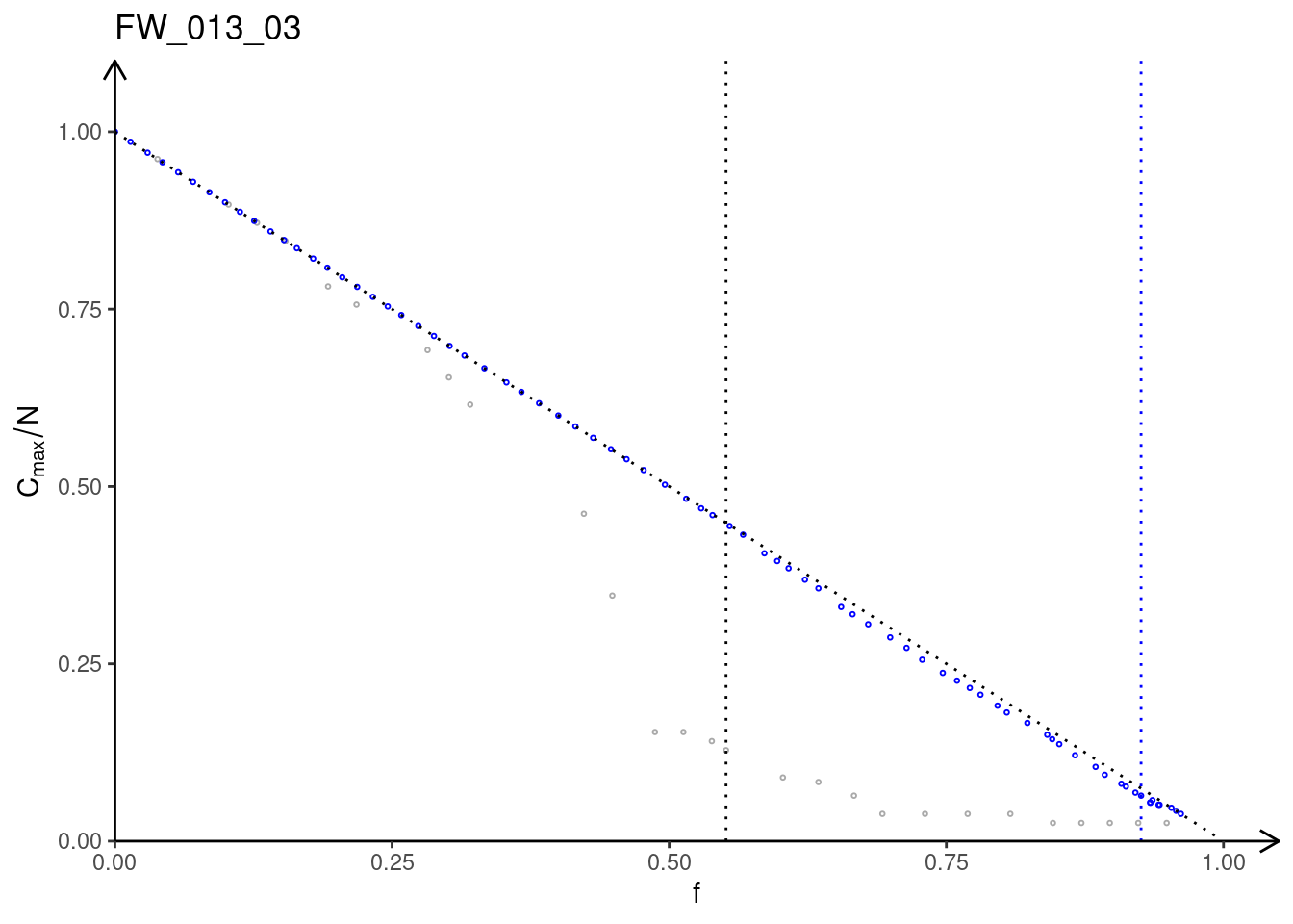
Do you observe significant differences in the robustness towards random removal and strategic (from most to least connected) removal of nodes in the two different networks.
Assuming that specialized species in the two considered empirical networks are more susceptible to extinction than generalists, e.g., because of climate change, which scenario do you expect to be more representative of what might happen in Nature: a decrease of the largest cluster due to random removal of nodes or due to strategic removal from the most connected to the least connected node?
Save your data
Please save the variables used in the plots running the following command
save(df_M_PL_015_rnd_analysis, df_M_PL_015_mtl_analysis, f_c_M_PL_015_rnd, f_c_M_PL_015_mtl,
     file="~/ecological_networks_2024/workspace/03-22_network_robustness/data_ex_M_PL_015.RData")
save(df_FW_013_03_rnd_analysis, df_FW_013_03_mtl_analysis, f_c_FW_013_03_rnd, f_c_FW_013_03_mtl,
file="~/ecological_networks_2024/workspace/03-22_network_robustness/data_ex_FW_013_03.RData")- CHECK: Another
*RDatafile should appear in the folder03-16_toolkit_network_analysis. If you want to be hundred percent sure that everything worked well, you can reload the variables from the created files:
load("~/ecological_networks_2024/workspace/03-22_network_robustness/data_ex_M_PL_015.RData")
load("~/ecological_networks_2024/workspace/03-22_network_robustness/data_ex_FW_013_03.RData")
and produce your plots again.
Solutions
Exercise 1
The expected output of the plots is displayed in the section Exercise 1 along with the code chunk to produce it.
In the following we will reply to the questions that were posed, point by point.
\(\bullet\) In your opinion, what defines the extent of the region where data-collapsing is realized?
ANSWER:
The denominators for \(x\) and \(y\) in the equations
\[\begin{equation}
y=\frac{C_{max}}{N^{\Delta_c}}
\quad \text{vs}\quad
x=\frac{f-f_c}{N^{\Delta_f}}
\end{equation}\]
play the role of characteristic scales like, e.g., the decay time \(\tau\) in a standard exponential decay
\[\begin{equation}
n(t)=n_0{\rm e}^{-t/\tau}
\end{equation}\]
The characteristic scales associated with the \(x\) and \(y\) variables are \(N^{\Delta_f}\) and \(N^{\Delta_c}\), respectively. This implies that we can expect the relationship between \(x\) and \(y\) given above to hold equally well for different values of \(N\) where
\[\begin{equation}
C_{max} < N^{\Delta_c}
\quad \text{and}\quad
|f-f_c| < N^{\Delta_f}
\end{equation}\]
(or some other multiple of the characteristic length scales \(N^{\Delta_f}\) and \(N^{\Delta_c}\)). This means that in first place \(N\) determines the extent of the region where data-collapsing is realized?
One student correctly observed that, since \(\Delta_f\) and \(\Delta_c\) depend on the topology of the network, the topology also plays a role in defining the extent of this region.
If you have answered \(N^{\Delta_f}\) and \(N^{\Delta_c}\), we are already pretty happy.
\(\bullet\) Do you notice any difference between the data-collapsing realized in the two models (honeycomb lattice and Erdos-Renyi graph)? Is the master curve the same?
ANSWER:
The critical fraction of removed nodes is \(f_c = 0.303\) for the honeycomb lattice and \(f_c = 0.75903\) for the Erdos-Renyi graph. Therefore, the honeycomb lattice is less robust against random removal of nodes compared to the Erdos-Renyi model.
The two master curves are not the same. The one obtained for the honeycomb lattice is relatively flat for negative values of \(x\) and has a sudden drop when \(x\) crosses zero to take positive values, on a log-log scale. For \(x>0\), it displays an upwards concavity.
The master curve obtained for the Erdos-Renyi graph starts decaying smoothly already for negative values of \(x\), showing a rounded shoulder on a log-log scale. It displays a nearly linear behavior (still on a log-log scale!) across the critical point \(x=0\). For \(x>0\), it also has an upwards concavity.
Exercise 2
Assume you were in the COVID-19 taskforce and you were asked for advice to hinder the pandemic. A possible strategy could be to change people habits so that their contact network becomes disconnected (subcritical phase).
\(\bullet\) Lookup the df_helsemere_rnd_analysisdataframe
df_helsemere_rnd_analysis %>% formattable()
# one finds that
# C_max, f, kappa
# 8.400000  0.9850394   2.013910
# 7.450000  0.9858268   1.925250
#
# extrapolating we get roughly C_max = 8
and identify the size of the largest cluster \(C_{max}\) corresponding to the critical threshold of \(\kappa \simeq 2\) (Molloy-Reed criterion).
ANSWER:
\(C_{max} =8\) (see above).
\(\bullet\) Play around with the values of \(R\) and \(t_{inf}\) till a similar value of \(C_{max}\) as that determined at the previous point is obtained.
ANSWER:
R <- 10 # set the distance

time_inf <- 12*5. # 5 hours within 48 h
my_inc_mat <- interaction_by_distance_and_time(data_haslemere, R+1, time_inf)
my_graph <- graph_from_incidence_matrix(my_inc_mat)
lower_C_max <- max(igraph::components(my_graph)$csize)
# lower_C_max = 6

time_inf <- 12*4. # 4 hours within 48 h
my_inc_mat <- interaction_by_distance_and_time(data_haslemere, R+1, time_inf)
my_graph <- graph_from_incidence_matrix(my_inc_mat)
upper_C_max <- max(igraph::components(my_graph)$csize)
# upper_C_max = 9
\(\bullet\) Provide a concrete suggestion for decision makers…
ANSWER:
“We need to set rules (e.g., lockdown) in order that ONLY people who in ordinary conditions spend at least two hours (better two-and-half) per day at a distance smaller that 10 meters can keep interacting”.
Exercise 3
The expected output of the plots is displayed in the section Exercise 3 along with the code chunk to produce it.
In the following we will reply to the questions that were posed, point by point.
\(\bullet\) In your opinion, is the Molloy-Reed criterion satisfactory in predicting the critical fraction of nodes at which the largest cluster should “evaporates” into a disconnected network? Comment on the results.
ANSWER:
The Molloy-Reed criterion is a good starting point and seems to work reasonable well for RND removal strategy applied to the network M_PL_015. We should not expect it to predict the correct value of \(f_c\), especially not in all cases. In fact, for strategic removal, from most to least connected node, the Molloy-Reed criterion predicts a value of \(f_c\) that is significantly higher than the observed one.
\(\bullet\) The critical value of the Molloy-Reed connectivity parameter
\[\begin{equation}
\kappa_c =\frac{\langle k^2\rangle}{\langle k\rangle} = 2
\end{equation}\]
below which a network is expected to be disconnected is derived within
the configuration model, namely assuming that a priori every node in the network could be connected with any other one.
Do you think this assumption is fulfilled by a bipartite network?
ANSWER:
In ecological bipartite networks, nodes (species) are divided into two disjoint guilds meaning that the nodes (species) of one guild ONLY interact with nodes (species) of the other guild. Therefore, it is not true that that every node in the network has the same a-priori probability to be connected with any other one. This actually applies to any bipartite network.
- Bonus Add to the previous plots the so-called secondary-extinction curve, namely the fraction of surviving consumers as a function of the removed resources.
ANSWER:
One should remove only species of one guild and plot the second and the third column returned by the function rweboflife::inverse_percolation(), i.e.n_nodes2 versus n_nodes1. For random removal strategy the input parameters should be adapted as follows:
Exercise 4
As for the previous section, the expected output of the plots obtained for the foodweb FW_013_03 is displayed in the section Exercise 4 along with the code chunk to produce it.
In the following we will reply to the questions that were posed, point by point.
\(\bullet\) Do you observe significant differences in the robustness towards random removal and strategic (from most to least connected) removal of nodes in the two different networks.
ANSWER:
The pollination network M_PL_015 appears to be more robust than the foodweb FW_013_03, especially in regards to strategic removal of nodes, from the most to the least connected. Both networks are significantly robust against random removal of nodes.
For the foodweb FW_013_03, the Molloy-Reed criterion provides a more accurate prediction of the relative difference between the critical fractions \(f_c\) at which the largest cluster “dissolves” into a disconnected network obtained with the two removal strategies.
\(\bullet\) Assuming that specialized species in the two considered empirical networks are more susceptible to extinction than generalists, e.g., because of climate change, which scenario do you expect to be more representative of what might happen in Nature: a decrease of the largest cluster due to random removal of nodes or due to strategic removal from the most connected to the least connected node?
ANSWER:
To perform this study properly one should know the extinction risk, due to climate change, of each species. In the absence of further information, one can assume that specialized species be more at risk than generalists. Without additional knowledge and between the two options that are given, the random removal of nodes is more representative of what might happen in Nature.