8 Analysis of networks of genetic spatial variation
Miguel Roman
session 28/03/2024
8.1 Introduction
In this practical exercise we will build networks of genetic spatial variation across populations using the popgraph package and analyze them using different mathematical tools. Before starting, we need to load some more packages.
8.1.1 The data
During this practice we will work with the lopho dataset, which is included in popgraph. This dataset contains information of genetic relatedness between and within different populations of Lophocereus schottii, a cactus endemic from the sonoran desert, north-west of Mexico, Baja California and Sinaloa.

Lophocereus schottii from Wikimedia Commons, the free media repository. Retrieved 15:15, March 22, 2023 from https://commons.wikimedia.org/w/index.php?title=File:Pachycereus_schottii_(5782222323).jpg&oldid=635587691.
.jpg&oldid=635587691)
First, let’s start building our graph by loading the lopho dataset. When representing it as a network, each node corresponds to a sampling location (i.e., a ‘population’), and they are colored differently depending on the region they belong to: Baja California or Sonora. The size of the node corresponds to the genetic covariance inside the sampled population, and the weight of each link is the genetic distance between them (larger values mean they are less related).
## [1] "name" "size" "color" "Region"## [1] "weight"
8.2 Network construction: adding spatial context
The graph above only shows the topology of the network, without locating the nodes in a particular position. Now let’s add spatial data from the baja dataset. This dataset contains the geographical coordinates of the sampling locations in lopho. This way, we will be able to represent the graph in a geographical context.
data(baja)
lopho <- decorate_graph( lopho, baja, stratum="Population") # adds the information to the graph
nodedata <- read.csv("~/ecological_networks_2024/downloads/Data/genetic_network_analysis/lopho_nodeData.csv",header=TRUE) #homemade dataset needed later on

lopho.nodes <- to_SpatialPoints(lopho)
lopho.edges <- to_SpatialLines(lopho)

igraph::list.vertex.attributes( lopho ) # now it includes "Latitude" and "Longitude"
## [1] "name" "size" "color" "Region" "Latitude" "Longitude"Now, we can use ggplot2 to explore this network placing the nodes according to their geographical location. We will also add a tag with each population’s short name:
library(ggplot2)

p <- ggplot() + geom_edgeset( aes(x=Longitude,y=Latitude), lopho, color="darkgrey" )
p <- p + geom_nodeset( aes(x=Longitude, y=Latitude, color=color, size=size), lopho)
p <- p + xlab("Longitude") + ylab("Latitude")
p <- p + geom_label(data=nodedata, mapping = aes(Longitude, Latitude, label=name, fill = color), colour = "white", size =2.5, fontface = "bold", nudge_y = 0.5)
#p +theme_linedraw()
p+theme_minimal()
We can even go further and show the map to get a better understanding of the type of landscape, water bodies, potential gene flow barriers and so on. If we load alt we will find a raster object (a map, in this case) of terrain elevation. By plotting everything together we obtain the following figure:
library(raster)
library(grid)
library(scales)
library(viridis)
data(alt)
test_spdf <- as(alt, "SpatialPixelsDataFrame")
test_df <- as.data.frame(test_spdf)
colnames(test_df) <- c("elevation", "x", "y")

p <- ggplot() + geom_tile(data=test_df, aes(x=x, y=y, fill=elevation), alpha=0.6) +scale_fill_gradientn(colours = terrain.colors(10)) #
p <- p + geom_edgeset( aes(x=Longitude,y=Latitude), lopho, color="black" )
p <- p + geom_nodeset( aes(x=Longitude, y=Latitude, color=color, size=size), lopho)
p <- p + xlab("Longitude") + ylab("Latitude")
p +theme_minimal()
8.3 Network Analysis
Now we will analyze the network to study how gene flow is structured. This can help us finding key regions for targeting conservation management efforts, or regions that have very similar genetic composition (which is also useful to avoid extra efforts in keeping populations separate when trying to preserve suspected lineages). Pholosophically, regarding the genetic connectivity in a metapopulation, we can distinguish four elements:
- Regions of high genetic covariance (clusters), detected with community detection algorithms and tested calculating modularity.
- Elements connecting regions (bridges), detected with betweenness centrality.
- Elements disconnecting regions (barriers), also detected with community detection algorithms and tested with the assortativity coefficient.
- Elements increasing connectivity inside the region (hubs), detected with eigenvector centrality or node degree.
8.3.1 Community Detection
As you learned in previous lectures, modularity is a structural metric explaining how much a network is partitioned into “modules” that are more connective inside than between them. By measuring modularity in a population graph we can get information about the genetic structure of the sampling locations. For example, we can expect that our populations will be separated into two large clusters: Baja California and Sonora, which are already predefined in the dataset. The genetic structure can have finer details at smaller scales. In the example below, we use the Louvain algorithm cluster_louvain from igraph to detect the partitions. We can see that there is a previously unnoticed North-South genetic difference in the region of California:

As before, we can set this in a geographical context with some more plots and understand how the water body of the Sea of Cortés effectively acts as a barrier isolating regions genetically:
pal <- brewer.pal(n=length(wc),"Pastel1")
V(G)$community <- pal[wc$membership]
E(G)$closeness <- 1/(E(G)$weight)
nodedata$community <- pal[wc$membership]

p <- ggplot()
p <- p + geom_edgeset( aes(x=Longitude,y=Latitude, size=closeness), G)
p <- p + geom_nodeset( aes(x=Longitude, y=Latitude, color=community, size=size, label = V(G)$name), G)
p <- p + xlab("Longitude") + ylab("Latitude")
p <- p + geom_label(data=nodedata, mapping = aes(Longitude, Latitude, label=name, fill = community), colour = "white", size =2.5, fontface = "bold", nudge_y = 0.5)
p +theme_void() 
p <- ggplot() + geom_tile(data=test_df, aes(x=x, y=y, fill=elevation), alpha=1) +scale_fill_gradientn(colours = terrain.colors(10)) #+scale_fill_viridis_c(option = "magma")#+ scale_fill_viridis()
p <- p + geom_edgeset( aes(x=Longitude,y=Latitude), G, color="black", )
#p <- p + geom_nodeset( aes(x=Longitude, y=Latitude, color=community, size=size), G)
p <- p + geom_nodeset( aes(x=Longitude, y=Latitude, size=size, label = V(G)$name), G, shape = 21, fill = V(G)$community, stroke = .5, color = "black")
p <- p + xlab("Longitude") + ylab("Latitude")
p +theme_minimal()
For the detected partition, we can calculate modularity as follows:
## [1] 0.502034Modularity is not a categorical measure, meaning that it is represented in a scale ranging from highly modular (values close to 1) to highly anti-modular (values close to -1). The obtained value tells that the network is quite modular for the detected partition.
8.3.1.0.1 Exercise 1
As you can see above, the Louvain algorithm takes an argument called resolution. Try to find the appropiate value of resolution that gives the two clusters matching the regions from the dataset (one node will not match). Pay attention to the change in the value of modularity. What does this difference mean?
8.3.2 Finding bridges
Betweenness centrality is a useful measure for identifying bridge nodes, which are nodes that, if removed, would disconnect the network into multiple components. Many of the shortest paths between different pairs of nodes in the network pass through these nodes, making them important for maintaining connectivity. These nodes are of special interest for conservation management, since they keep the gene flow among subpopulations.
bc <- igraph::betweenness(G,weights=E(G)$weight) # betweenness centrality

V(G)$bc <- bc

p <- ggplot() + ggtitle("Node betweenness centrality")
p <- p + geom_edgeset( aes(x=Longitude,y=Latitude), G)
p <- p + geom_nodeset( aes(x=Longitude, y=Latitude, color=bc, size=bc, fill(data = data(data)), label = V(G)$name), G) + scale_color_gradient(low='yellow', high = 'red')
p <- p + xlab("Longitude") + ylab("Latitude")
#p <- p + geom_label(data=nodedata, mapping = aes(Longitude, Latitude, label=name, fill = bc), colour = "white", size =2.5, fontface = "bold", nudge_y = 0.5)
p +theme_minimal() 
In a similar way, edge betweenness centrality is a measure of how often an edge appears on the shortest path between pairs of nodes in a network. Edges with high betweenness centrality are those that have a high likelihood of being traversed by shortest paths and therefore are important for facilitating communication or flow of resources between different parts of the network.
eb <- igraph::edge_betweenness(G)
E(G)$eb <- eb
# Create plot
p <- ggplot() + ggtitle("Edge betweenness centrality")
p <- p + geom_edgeset(aes(x = Longitude, y = Latitude, color = eb, size = eb), G)+
  scale_size_continuous(range = c(0, 3))
p <- p + scale_color_gradient(low = 'yellow', high = 'red')
p <- p + geom_nodeset(aes(x = Longitude, y = Latitude, label = name), G)
p <- p + xlab("Longitude") + ylab("Latitude")
p + theme_minimal()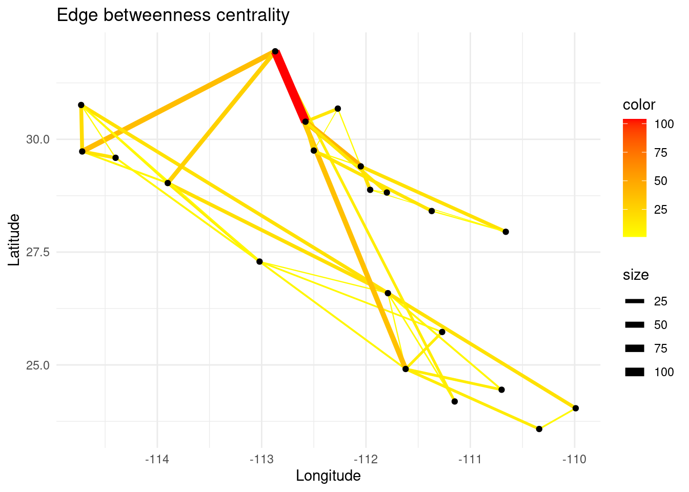
8.3.3 Finding hubs for gene flow
The degree of a node is the number of links it has. It is a local measure that can be used to determine if a node can be called a ‘hub’, i.e. a highly connected node.
V(G)$deg <-  igraph::degree(G)

p <- ggplot() + ggtitle("Node degree")
p <- p + geom_edgeset( aes(x=Longitude,y=Latitude), G)
p <- p + geom_nodeset( aes(x=Longitude, y=Latitude, color=deg, size=deg, fill(data = data(data)), label = V(G)$name), G) + scale_color_gradient(low='yellow', high = 'red')
p <- p + xlab("Longitude") + ylab("Latitude")
#p <- p + geom_label(data=nodedata, mapping = aes(Longitude, Latitude, label=name, fill = bc), colour = "white", size =2.5, fontface = "bold", nudge_y = 0.5)
p +theme_minimal() 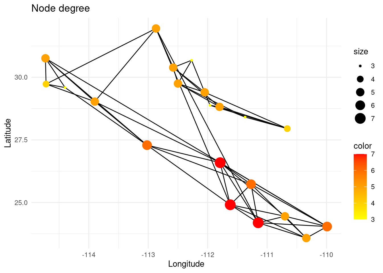
However, the degree of a node does not mean that the node is globally meaningful for the total gene flow in that region of the network, since its neighbors can be very peripheral (low degree). On the other hand, the eigenvector centrality of a node measures the extent to which it is connected to other nodes that are themselves well-connected.
ec <- eigen_centrality(G)$vector
V(G)$ec <- ec
p <- ggplot() + ggtitle("Node eigenvector centrality")
p <- p + geom_edgeset( aes(x=Longitude,y=Latitude), G)
p <- p + geom_nodeset( aes(x=Longitude, y=Latitude, color=ec, size=ec, fill(data = data(data)), label = V(G)$name), G) + scale_color_gradient(low='yellow', high = 'red')
p <- p + xlab("Longitude") + ylab("Latitude")
#p <- p + geom_label(data=nodedata, mapping = aes(Longitude, Latitude, label=name, fill = bc), colour = "white", size =2.5, fontface = "bold", nudge_y = 0.5)
p +theme_minimal() 
8.3.3.0.1 Extra exercise
As you will notice, eigenvector centrality can be correlated with the degree, but there are some differences between both measures and this can also give valuable information. How do you interpret this difference? (This exercise adds one point to the final score, but it is not necessary to reach the maximum. See “Wrap-up exercise” for more information on how the scoring works for this session).
8.3.4 Finding barriers for gene flow
Sometimes the landscape presents geographical features that make dispersal and gene flow difficult. In our map there is a water body called the Sea of Cortés, which could isolate populations. To test how much this suspected barrier impairs gene flow, we will use the assortativity coefficient. This metric measures if nodes that are connected tend to have similar attributes or not. In this case, the attribute will be the region label at each side of the proposed barrier, defined with the key Region.
#igraph::list.vertex.attributes(G)
assort_test <- igraph::assortativity(G,types1=V(G)$Region)
print(assort_test)
## [1] 0.8341308Although close to one, this value alone does not tell anything, so we must use null models to test our hypothesis. In the chunk below, we generate 500 rewired replicates of the original graph (using binary edge swap) and return their assortativity values. Then, we perform a Wilcoxon Rank Sum to contrast the value obtained before and test its significance.
generate_null_assort <- function(G,types1) {
  Gnull <- rewire(G, each_edge(prob=1)) # create null model
  igraph::assortativity(Gnull,types1=types1)
}
assorts_null <- replicate(500, generate_null_assort(G,types1=V(G)$Region))
#wilcox.test(assorts_null - mean(assorts_null)) # demo using the mean of the null model. It should not be significant.
wilcox.test(assorts_null - assort_test) # if p-value << 0.05, it is significantly different
##
## Wilcoxon signed rank test with continuity correction
##
## data: assorts_null - assort_test
## V = 0, p-value < 2.2e-16
## alternative hypothesis: true location is not equal to 0We can plot the distribution obtained from the null models together with a red stripe for our real observation.
hist(assorts_null, breaks=25,xlim= c(-1,1))
abline(v = assort_test, col = "red", lwd = 2)
legend("topright", legend=paste("observed =", assort_test), col="red", lty=1)
8.3.4.1 Extracting geographical profiles from transepts
It is also possible to get elevation profiles across the network edges as described below. This data can be used to understand how the features of the landscape found in this transept could be linked to the genetic covariance between populations. For instance, we can expect transepts with larger maximum height to represent lower genetic correlation, under the assumption that this species does not tolerate high mountain climates. This section only has the purpose of showing an idea, and we will not perform any analysis or calculation this time.
library(fields)
#df.edge <- data.frame(Weight=E(lopho)$weight )
#summary(df.edge)
tmp_edge <- lopho.edges[3]
#tmp_edge <- lopho.edges["Edge Ctv SenBas"]

plot(alt)
plot(tmp_edge,add=TRUE,col="red",lwd=3)
Elevation <- raster::extract( alt, tmp_edge )[[1]]
e <- extent( tmp_edge )

pDist <-rdist.earth(t(as.matrix(e)),miles=FALSE)
physD = pDist[upper.tri(pDist)]
transept <- seq(from = 0, to = physD, length.out = length(Elevation))

#plot(transept, Elevation, type = "l", ylim = c(0, 3000), xlab="map distance (Km)", ylab="elevation (m)")
plot(transept, Elevation, type = "l", xaxt = "n", yaxt = "n", bty = "n", ylim = c(0, 2000), xlab="map distance (Km)", ylab="elevation (m)")
axis(side = 1, at = pretty(transept))
axis(side = 2, at = pretty(Elevation))
8.3.5 Working with node properties
The spatial data we are using has been retrieved from https://worldclim.org. In this database, we can find other interesting datasets. Let us load data for solar radiation and average temperature:
#
srad <- crop(raster('~/ecological_networks_2024/downloads/Figures/genetic_network_analysis/wc2.1_2.5m_srad_12.tif'), extent(alt))
#srad <- crop(raster('~/ecological_networks_2024/downloads/Figures/genetic_network_analysis/wc2.1_2.5m_srad_06.tif'), extent(alt))
tavg <- crop(raster('~/ecological_networks_2024/downloads/Figures/genetic_network_analysis/wc2.1_2.5m_tavg_12.tif'), extent(alt))
#plot(srad)
#plot(tavg)
map_tavg <- as.data.frame(as(tavg, "SpatialPixelsDataFrame"))
colnames(map_tavg) <- c("average_temperature", "x", "y")
V(G)$tavg <- raster::extract( tavg, lopho.nodes )
p <- ggplot() + geom_tile(data=map_tavg, aes(x=x, y=y, fill=average_temperature), alpha=1) +scale_fill_viridis_c(option = "plasma")
p <- p + geom_edgeset( aes(x=Longitude,y=Latitude), G, color="black")
p <- p + geom_nodeset( aes(x=Longitude, y=Latitude, size=size), G)
p <- p + xlab("Longitude") + ylab("Latitude")
p +theme_minimal()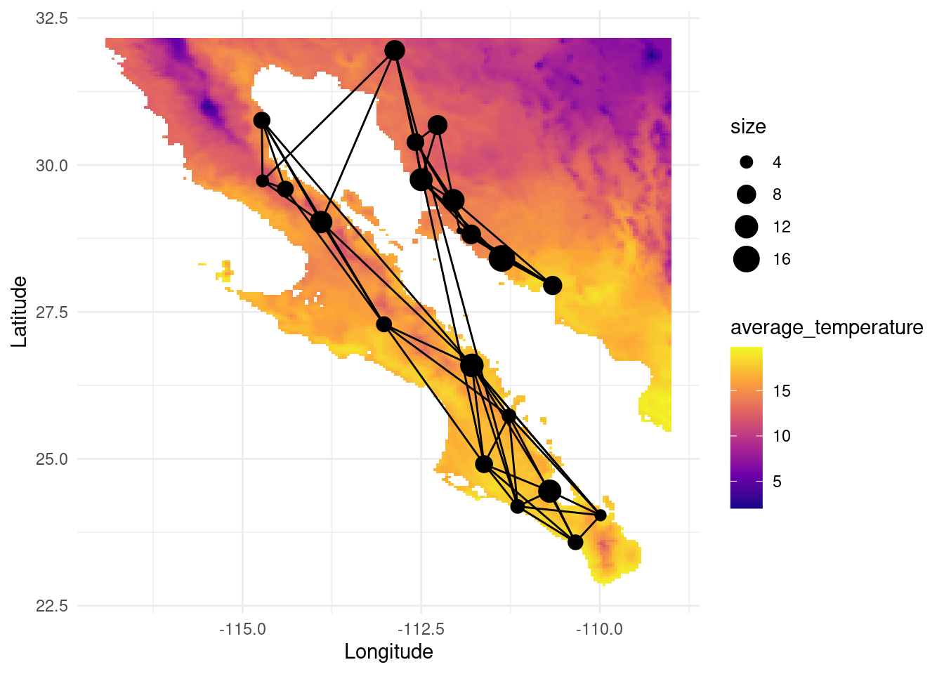
map_srad <- as.data.frame(as(srad, "SpatialPixelsDataFrame"))
colnames(map_srad) <- c("solar_radiation", "x", "y")
V(G)$srad <- raster::extract( srad, lopho.nodes )
V(G)$alt <- raster::extract( alt, lopho.nodes )
V(G)$deg <-  igraph::degree(G)

p <- ggplot() + geom_tile(data=map_srad, aes(x=x, y=y, fill=solar_radiation), alpha=1) +scale_fill_viridis_c(option = "magma")
p <- p + geom_edgeset( aes(x=Longitude,y=Latitude), G, color="black")
p <- p + geom_nodeset( aes(x=Longitude, y=Latitude, color="black", size=size), G)
p <- p + xlab("Longitude") + ylab("Latitude")
p +theme_minimal()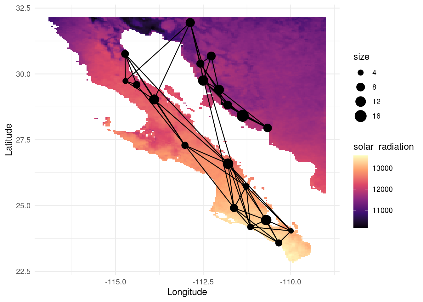
The information attributed to the nodes can be helpful to determine abiotic factors affecting the gene flow and the dispersal capabilities (e.g. wind speed for seed dispersal, solar radiation affecting fruit ripening, local adaptation to temperature or elevation, etc).
8.3.5.0.1 Exercise 2
Try to find meaningful correlations between the geographical variables tavg, srad, alt and the network-topological ones, such as deg, ec or bc. Below, you will find a sample plot showing a pretty obvious correlation between solar radiation and average temperature. It is not needed to provide a fit correlation statistic, a plot with a trendline that is more or less visually following the cloud of points should suffice. How do you interpret it?
nodedata_2 <- igraph::as_data_frame(G, what = "vertices")
p <- ggplot( nodedata_2, aes(srad, tavg) ) + geom_point() + geom_smooth(method='lm', formula= y~x) #stat_smooth(method="loess")
p+theme_minimal()
8.3.5.0.2 Exercise 3
Now that we have more terrain information, can you study the assortativity coefficient with a climatic variable? This will tell you how nodes with similar abiotic conditions tend to be genetically related, or how changes in these conditions can present a barrier to gene flow. Should we extract conclusions from the results you obtained or do you expect any potential bias? Tip: replace the Region label in the code above (from the assortativity example) with another vertex attribute, such as srad, alt or tavg.
8.3.6 Other analyses
8.3.6.1 Comparing physical and genetic distances
It is expectable that genetic relateness decreases with physical distance. Below, you will find an example showing how to compute the physical distance between nodes (taking into account earth’s surface curvature!), and compare it with the conditional genetic distance, given by the shortest path connecting these nodes. The trendline shows an increase (genetic distance is the inverse of relatedness) until a plateau seems to be reached.
cGD <- to_matrix( G, mode="shortest path")
pDist <- rdist.earth( cbind( V(G)$Longitude, V(G)$Latitude ) )
df <- data.frame( cGD=cGD[upper.tri(cGD)], Phys=pDist[upper.tri(pDist)])
cor.test( df$Phys, df$cGD, method="spearman")
##
## Spearman's rank correlation rho
##
## data: df$Phys and df$cGD
## S = 729992, p-value < 2.2e-16
## alternative hypothesis: true rho is not equal to 0
## sample estimates:
## rho
## 0.5270434qplot( Phys, cGD, geom="point", data=df) + stat_smooth(method="loess") + xlab("Physical Distance") + ylab("Conditional Genetic Distance")
8.3.6.2 Testing coevolution using graph congruence

Upiga virescens1.jpg. (2021, November 16). Wikimedia Commons, the free media repository. Retrieved 17:23, March 28, 2023 from https://commons.wikimedia.org/w/index.php?title=File:Upiga_virescens1.jpg&oldid=607660035
The senita moth Upiga virescens is known for being an obligate pollinator of Lophocereus schottii. Therefore, we could expect some degree of coevolution between both species. Below, we load the upiga dataset (with the same structure as lopho, and collected in nearly the same locations), and compare both graph topologies using graph topological congruence. First, let us explore the topology of this new graph. With a quick assortativity test (and also visually) we can see that the Sea of Cortés is not acting as much of a barrier because they can probably move more easily than a cactus:
data(upiga)
upiga <- decorate_graph(upiga,baja,stratum="Population")

igraph::assortativity(lopho,types1=V(lopho)$Region)
## [1] 0.8341308## [1] 0.3515528p <- ggplot() + geom_tile(data=test_df, aes(x=x, y=y, fill=elevation), alpha=0.6) +scale_fill_gradientn(colours = terrain.colors(10)) #
p <- p + geom_edgeset( aes(x=Longitude,y=Latitude), upiga, color="black" )
p <- p + geom_nodeset( aes(x=Longitude, y=Latitude, color=color, size=size), upiga)
p <- p + xlab("Longitude") + ylab("Latitude")
p +theme_minimal()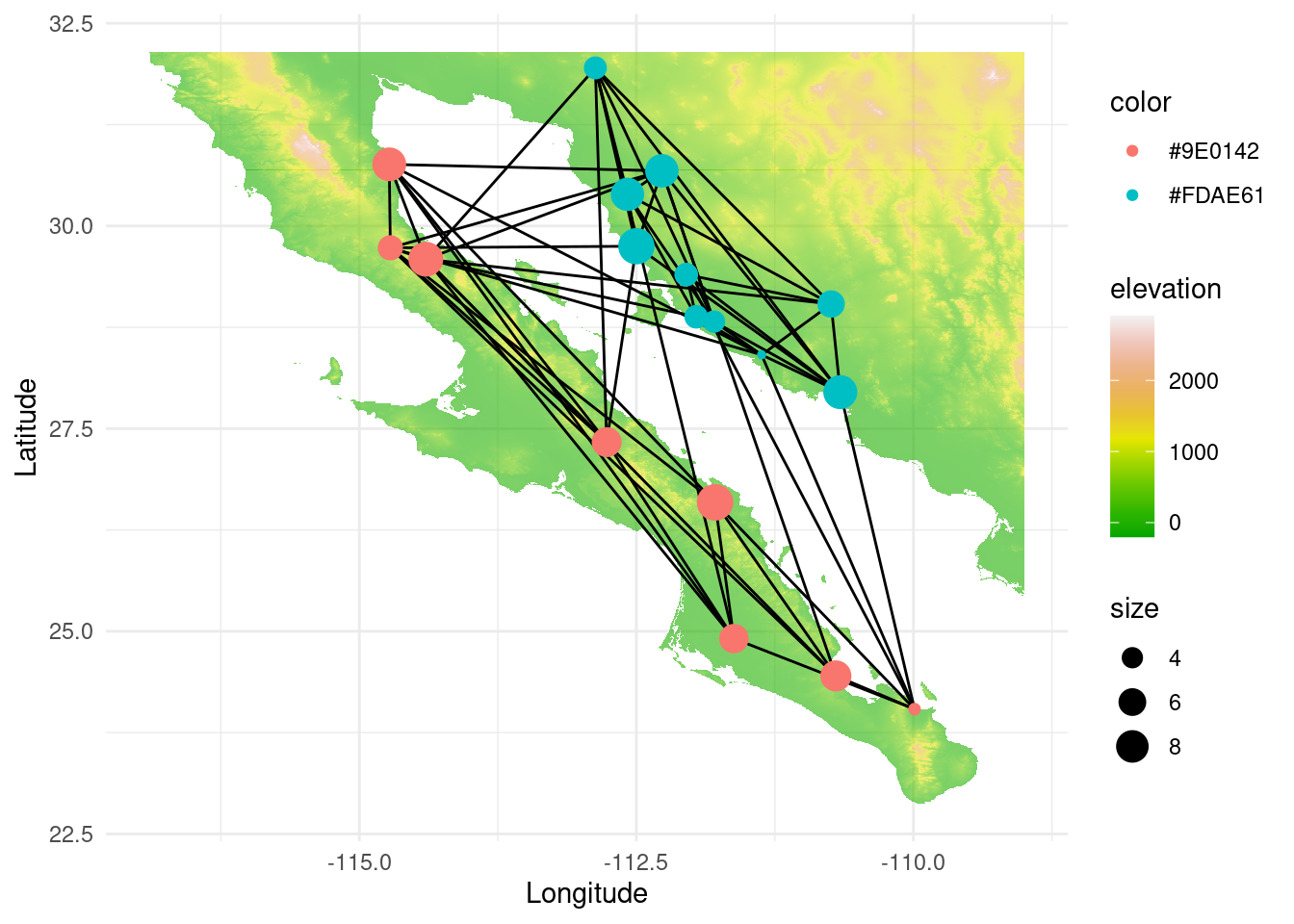
Now, let us compute the congruence graph. A congruence graph is the intersection of both node and edge sets of two graphs. Therefore, it gives information about the regions that are genetically related in both species. If coevolution is high, we could expect a high overlap.
cong <- congruence_topology(lopho,upiga)
cong <- decorate_graph(cong,baja,stratum="Population")

p <- ggplot() + geom_tile(data=test_df, aes(x=x, y=y, fill=elevation), alpha=0.6) +scale_fill_gradientn(colours = terrain.colors(10)) #
p <- p + geom_edgeset( aes(x=Longitude,y=Latitude), cong, color="black" )
p <- p + geom_nodeset( aes(x=Longitude, y=Latitude, color=color, size=size), cong)
p <- p + xlab("Longitude") + ylab("Latitude")
p +theme_minimal()
The congruence graph alone does not provide a metric for this overlap. To have a contrasting measure, we will calculate the congruence distance first for the lopho and upiga graphs, and then for a rewired version of both. Below we can see the p-values:
## [1] 3.599753e-11test_congruence(rewire(lopho, each_edge(prob=1)), rewire(upiga, each_edge(prob=1)), method="distance")$p.value # should NOT be significant## [1] 0.6976231# CDF is another metric, defined as "the probability ofhaving as many edges as observed in the congruence graph given the size of the edge sets in the predictor graphs".
#test_congruence(lopho,upiga, method="combinatorial")
#test_congruence(as.popgraph( rewire(lopho, each_edge(prob=1)) ), upiga, method="combinatorial")We can see that coevolving species can share similar genetic structures in space. This could be a powerful tool for detecting ecological interactions between species if genetic data is abundant.
8.4 Graph Pruning
In genetic relatedness networks it is common to obtain fully connected networks since all populations share some point of relatedness. However, in network analysis, the presence of a link is more important than the weight of the link itself. For this reason, we need to prune the graph after computing the relatedness between the sampled populations. Graph pruning consists on extracting a meaningful topology from a graph that contains more links than desired.
Let us first simulate the case of having a fresh dataset containing values of relatedness for all pairwise comparisons of the populations. Then, we will use different algorithms for disentangling the hidden genetic structure.
#load the data
df <- read.csv("~/ecological_networks_2024/downloads/Data/genetic_network_analysis/noisy_adj.csv",header=TRUE)
nodedata <- read.csv("~/ecological_networks_2024/downloads/Data/genetic_network_analysis/lopho_nodeData.csv",header=TRUE)

df <- subset(df, select = -c(name))
m <- unname(as.matrix(df))

G <- as.popgraph( m )
V(G)$name <- nodedata$name
V(G)$size <- nodedata$size
V(G)$color <- nodedata$color
V(G)$Region <- nodedata$Region
V(G)$Latitude <- nodedata$Lat
V(G)$Longitude <- nodedata$Long
E(G)$closeness <- 1/(E(G)$weight)

#plot the graph
p <- ggplot() + ggtitle("Fully connected graph")
p <- p + geom_edgeset(aes(x = Longitude, y = Latitude, color = weight, size = weight), G)+
  scale_size_continuous(range = c(0.5, 0))
p <- p + scale_color_gradient(low = 'red', high = 'white')
p <- p + geom_nodeset(aes(x = Longitude, y = Latitude, label = name), G)
p <- p + xlab("Longitude") + ylab("Latitude")
p + theme_minimal()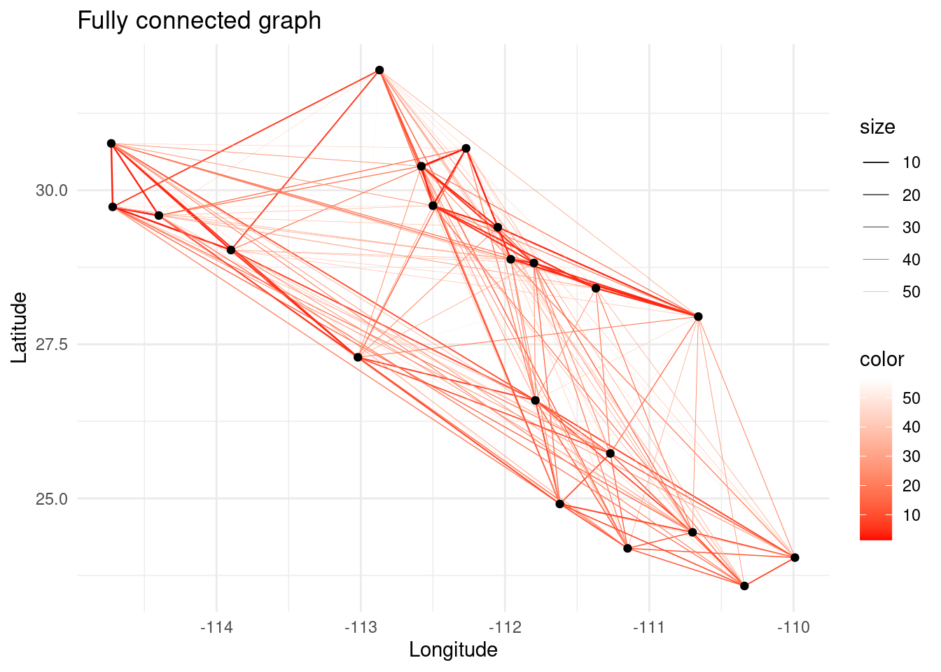
For pruning this graph we will call a homemade Python script especially built for this exercise that performs different types of algorithms to select which links should be removed. The available methods are:
thresholdremoves all edges with genetic distance above a given threshold, given by the parameter--param.singlecompsequentially removes edges, starting from the highest genetic distance, and stops right before splitting the network into two smaller components. Specifying--paramis useless here.mincovkeeps the minimal structure that explains the total covariance among populations. This is achieved using a more complex method based on a statistic called Edge Exclusion Deviance (EED) explained in Dyer & Nason (2004). If no--paramis specified, performs a sequential removal similar tosinglecomp, starting from lower EEDs. If--paramis specified (it becomes a confidence threshold), removes all edges whose EED is not included beyond the confidence threshold. The lower, the more astringent.
In the code chunk below there are some commented lines with other examples. I invite you to play around to see how they can give very different topologies depending on the algorithm and the parameter. Output is sent to a file which name can be specified (ex. --out= ~/ecological_networks_2024/downloads/Data/genetic_network_analysis/pruned_mincov.csv) by default called pruned.csv otherwise.
system('cd ~/ecological_networks_2024/workspace/03-28_genetic_networks_analysis && mkdir data')
system('cp ~/ecological_networks_2024/downloads/Data/genetic_network_analysis/* ~/ecological_networks_2024/workspace/03-28_genetic_networks_analysis/data')

#====================================================================

#system('cd ~/ecological_networks_2024/workspace/03-28_genetic_networks_analysis/data && python3 ../graph_pruning.py --f=noisy_adj.csv --method=threshold  --param=10.4')
#system('cd ~/ecological_networks_2024/workspace/03-28_genetic_networks_analysis/data && python3 ../graph_pruning.py --f=noisy_adj.csv --method=singlecomp ')
#system('cd ~/ecological_networks_2024/workspace/03-28_genetic_networks_analysis/data && python3 ../graph_pruning.py --f=noisy_adj.csv --method=mincov     --param=0.05') # confidence of 95 %
#system('cd ~/ecological_networks_2024/workspace/03-28_genetic_networks_analysis/data && python3 ../graph_pruning.py --f=noisy_adj.csv --method=mincov     --param=0.01') # confidence of 99 %
system('cd ~/ecological_networks_2024/workspace/03-28_genetic_networks_analysis/data && python3 ../graph_pruning.py --f=noisy_adj.csv --method=mincov     ') # Min. covariance while seeking percolation threshold.

#====================================================================

df <- read.csv("~/ecological_networks_2024/workspace/03-28_genetic_networks_analysis/data/pruned.csv",header=TRUE)
nodedata <- read.csv("~/ecological_networks_2024/workspace/03-28_genetic_networks_analysis/data/lopho_nodeData.csv",header=TRUE)


df <- subset(df, select = -c(name))
m <- unname(as.matrix(df))

G <- as.popgraph( m )
V(G)$name <- nodedata$name
V(G)$size <- nodedata$size
V(G)$color <- nodedata$color
V(G)$Region <- nodedata$Region
V(G)$Latitude <- nodedata$Lat
V(G)$Longitude <- nodedata$Long

p <- ggplot() + ggtitle("Pruned graph")
p <- p + geom_edgeset(aes(x = Longitude, y = Latitude, color = weight, size = weight), G)+
  scale_size_continuous(range = c(0.5, 0))
p <- p + scale_color_gradient(low = 'red', high = 'white')
p <- p + geom_nodeset(aes(x = Longitude, y = Latitude, label = name), G)
p <- p + xlab("Longitude") + ylab("Latitude")
p + theme_minimal()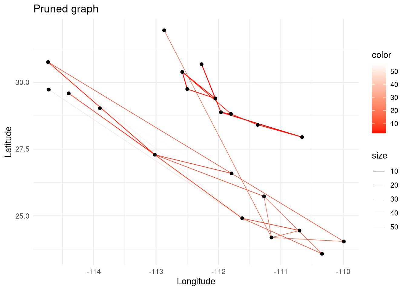
## [1] TRUE
# Plot the adjacency matrix with colors
adj_mat<-as.matrix(get.adjacency(G,attr='weight'))
par(mfcol=c(1,1),pty='s')
image(adj_mat, cex=.25)
8.5 Wrap-up exercise
Choose one of the analyses studied and show how the results might change dramatically depending on the pruning algorithm chosen (only one, too). The analyses can also be taken from the “Other analyses” section. The take-home message here is that the data cleaning stage in this type of studies (and many others!) is as important as the analysis stage. Data that has not been processed correctly can produce biased or meaningless results and lead to misinterpretations, thus potentially hindering our gain of knowledge and the progress of science.
Scoring for this session: All exercises (including extra) are valued over 6 points except for the wrap-up, which is scored over 12 points. Your grade for this session is the sum of all points divided by 5. This value is truncated to be 6 as maximum.
8.6 Feedback
I would appreciate your feedback :) You can submit it together with your exercise submissions, or alternatively through this link if you prefer to keep it anonymous. Thank you!
8.7 References
- Jones, T. B., & Manseau, M. (2022). Genetic networks in ecology: A guide to population, relatedness, and pedigree networks and their applications in conservation biology. Biological Conservation, 267, 109466.
- Dyer, R. J., & Nason, J. D. (2004). Population graphs: the graph theoretic shape of genetic structure. Molecular ecology, 13(7), 1713-1727.